Case study in confusing UX
Don Norman eat your heart out
In the midst of reading "The Design of Everyday Things", I think a bit of Norman's revelatory annoyance rubbed off on me. Before diving in, I'm keeping these fundamental principles of design in mind.
Let's start from the beginning, this is the process for accessing a jobs portal for Stantec. For the sake of this, lets just ignore that crappy UI.
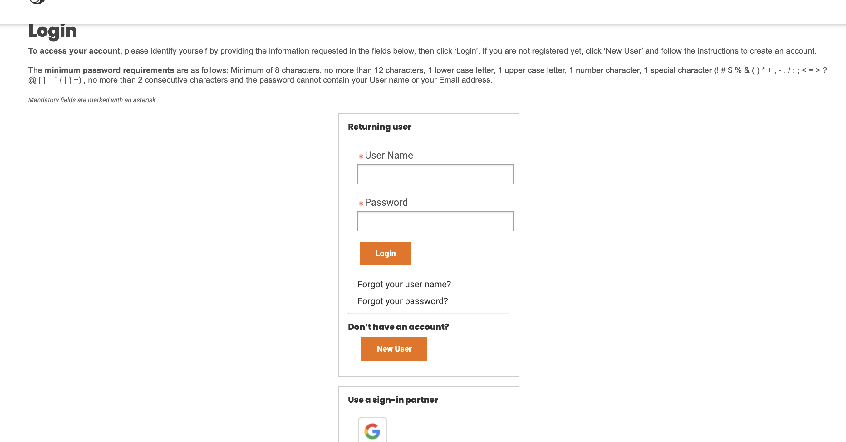 Notice that the site primes you with a blurb about the password requirements on a login screen. This is almost designed to be missed (but makes for good foreshadowing!). The disclaimer might be appropriate if this was a physical form. That piece of text is also a pointless signifier as the first part is redundant, and the second is irrelevant, why do I care about password requirements on a login screen?
Okay I don't have an account, hey look a Google sign-in (wew!), a familiar button that I readily click and then see this:
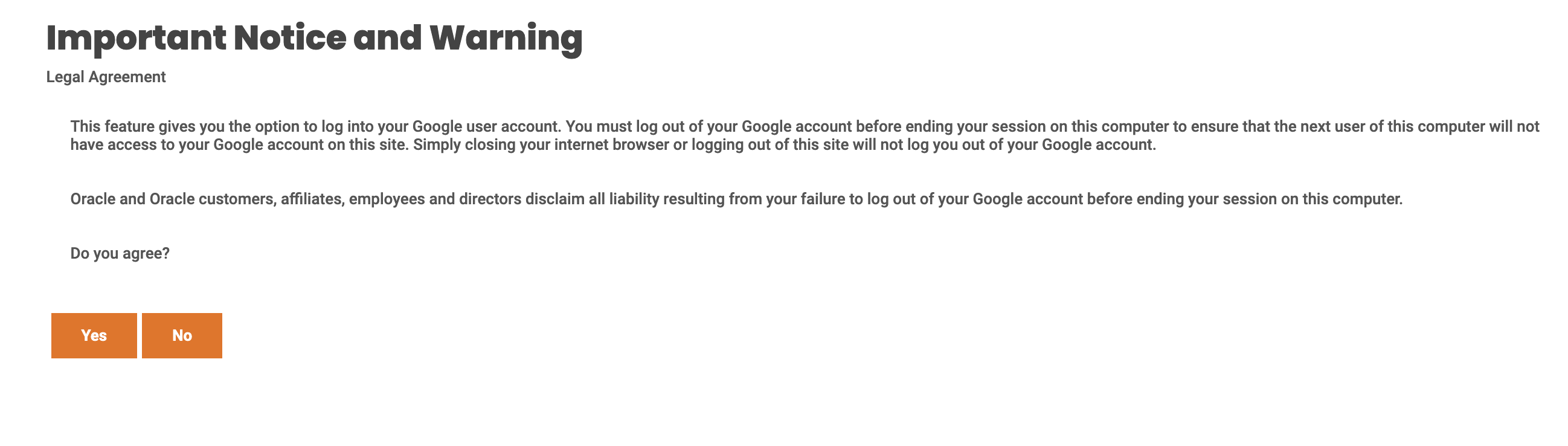 I'm on the right track, I'll just be able to use this and circumvent account creation. Strangely, choosing "Yes" or "No" leads...well, back to where we started. Back to the login screen (the first image in this blog post). Here the site has violated the principle of good feedback, with no indication of if I logged in, or what the purpose of the diversion was.
My conceptual model is also broken here, what I expect is to be finally logged in, since that's what the whole ceremony of the Google button was. Not knowing if that was successful or not, and seemingly landing back to where I started. I bravely hit the "New User" button and see this:
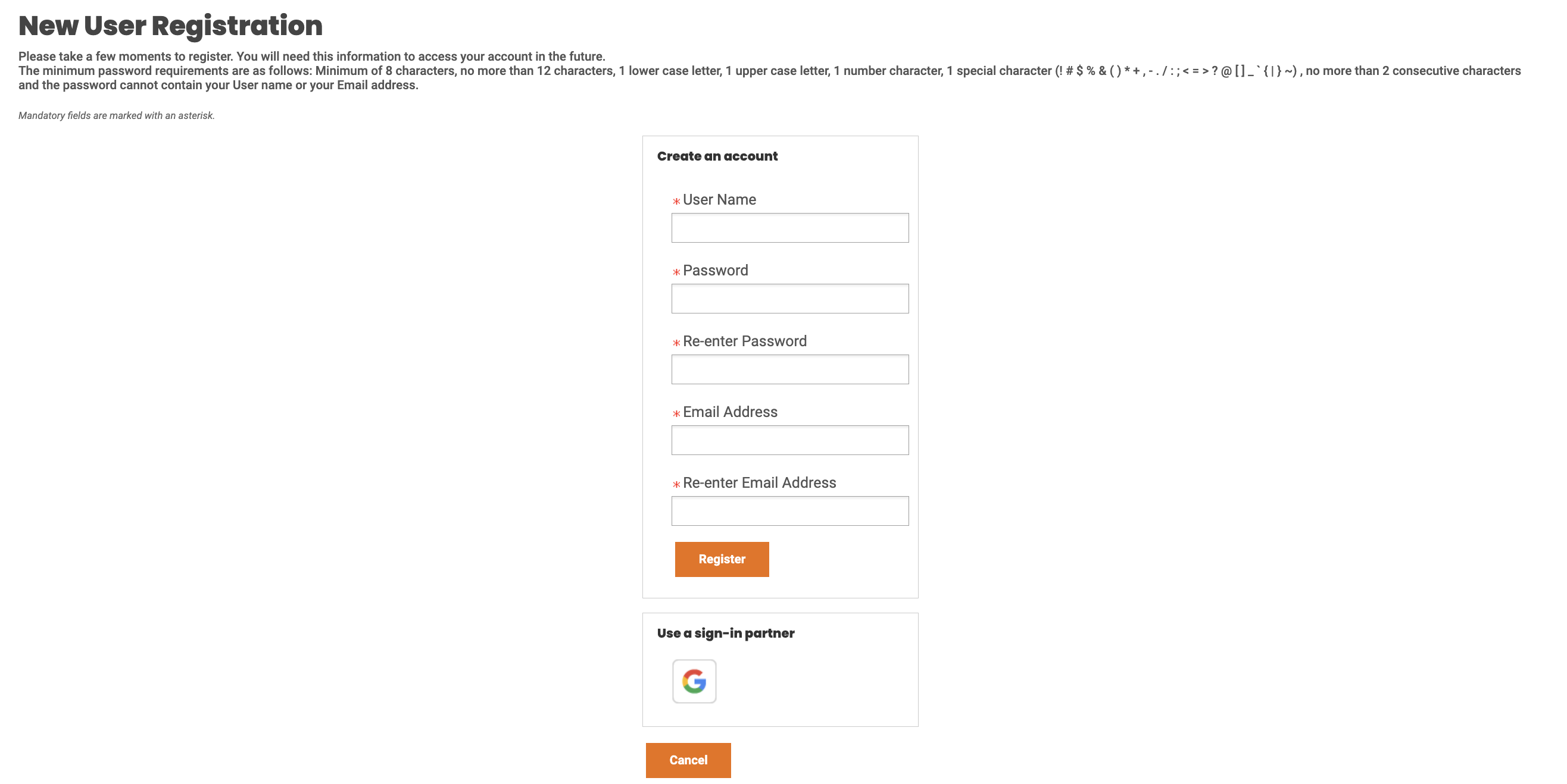
A page quite similar to the first one, and hey whats this, another Google button! My intuition here is: I'm on a new account screen, so I should automagically join and skip manual creation by using a sign in partner! Well...

Maybe this worked at some point? Maybe I gave my data to some man in the middle? At this point, frustration mounting, we reach the pièce de résistance, the namesake of this little blog post. Since I couldn't use Google, I bit the bullet and created an account, using Bitwarden to auto-fill a password (something that has, up until now, never gave me trouble):
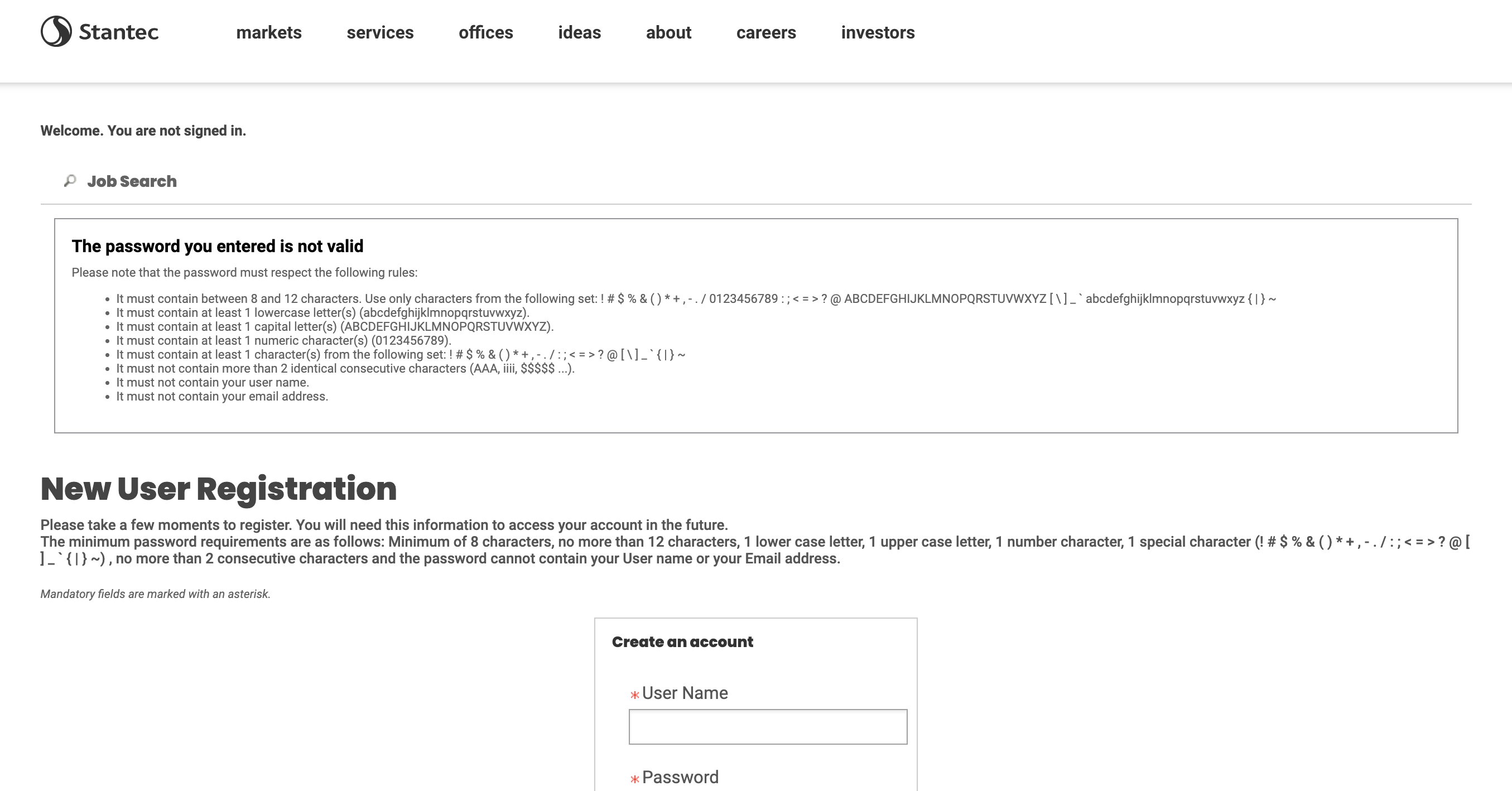
A huge, nausea inducing "error" message akin to being presented with a parking ticket, but with the absurdity of something that Terry Gilliam might come up with. What the hell is that!?
At this point it's important to say that you don't need a design book to tell you what's wrong. Or maybe you do, or, like above, you might need 8 separate instructions telling you what's wrong!
These kinds of messages place blame on the user. Arbitrarily precise errors exists solely due to, as Norman puts it, "the laziness of the programming team". In my mind, without introducing too much change, we can get rid of undue complexity by having a password strength meter, or implement a better SSO flow. Present the user with simple (contextual) instructions to pass a minimum threshold. Don't interrupt the user. When I submitted the form, it erased all my inputted fields. The solves are straightforward and there are countless best practices established.
In the end, I was entirely turned off by this flow. But it did inspire me to hastily scratch some stuff down about it. An important take away from me writing this down was to tackle a UX 'Learned Helplessness', wherein I would often blame myself for not following the "rules". In this instance, the rules suck, and the blame is put on the user. As Norman helpfully reiterates, we should eliminate the term human error from our work and show some degree of respect, empathy, and accommodation.